 PATROLDESK
 1:46
1:46
Sit down. Know what to do.
Tonight, Where, the block in 3D, the watch order. Steps 01–10.
These are real screens from PatrolDesk running on Pittsburgh’s published data — 70,140 incidents over 32 months, through August 31. Every screen was captured from PatrolDesk on 23 September 2026. Nothing is a mockup.
1:46
Tonight, Where, the block in 3D, the watch order. Steps 01–10.
 1:25
1:25
Staffing against demand, the watch model, the week by hour. Steps 04–07.
 1:30
1:30
Recording an order, the ledger, and a backtest that grades itself. Steps 09–11.
New to PatrolDesk? Start with the five-minute briefing for chiefs (5:21). Five more in the feature series: search and ask, the daily brief, Before You Go, game day, and clearance by arrest.
A first visit asks what you came to do — run tonight's watch, review an area, check an order, or take the tour — and opens there. It comes back each new session until you tick don't show this again. A share link never sees it.
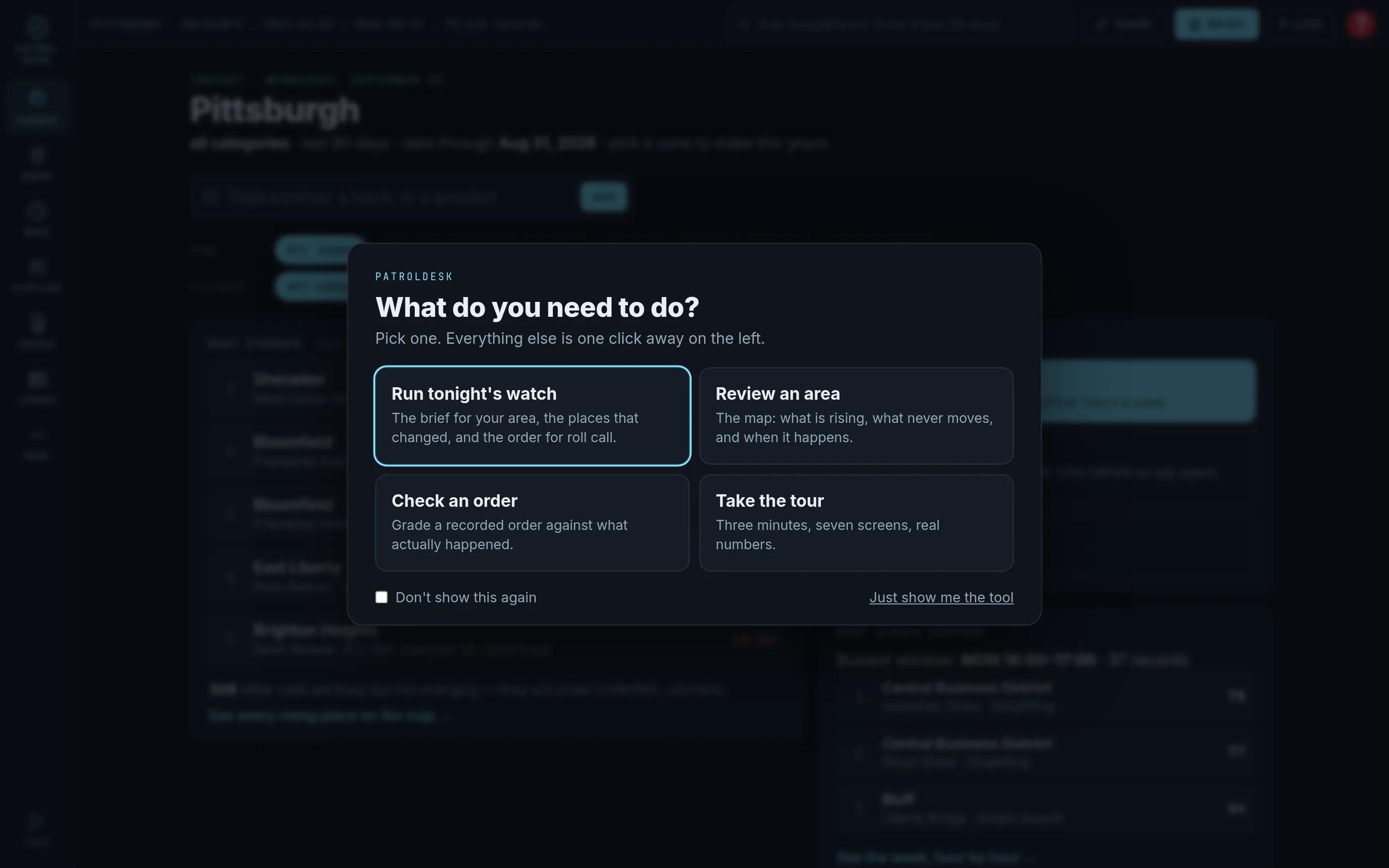
Four tiles, one checkbox. Picking a tile is not a preference — it is the same as clicking that word on the rail.
Nobody is taught a tool at roll call. The first screen has to make the next click obvious, and this one has four.
Pick a zone and a category with the chips. The screen reads top to bottom: what changed, the next step, what always happens, whether the roster matches.

Zone 5, all categories, data through August 31. Five rising cells with their sigma; the top two on Friendship Avenue. 99 other cells are busy but not changing — and the screen says so. NEXT STEP is one button to the watch order, with the options and the cheapest cost already in the label.
Every line is the same function the other screens use. There is no summary written by hand, so it can never disagree with the map.
Type a corner, a block or a street in the Tonight box or the header and the map goes there with the records behind it.
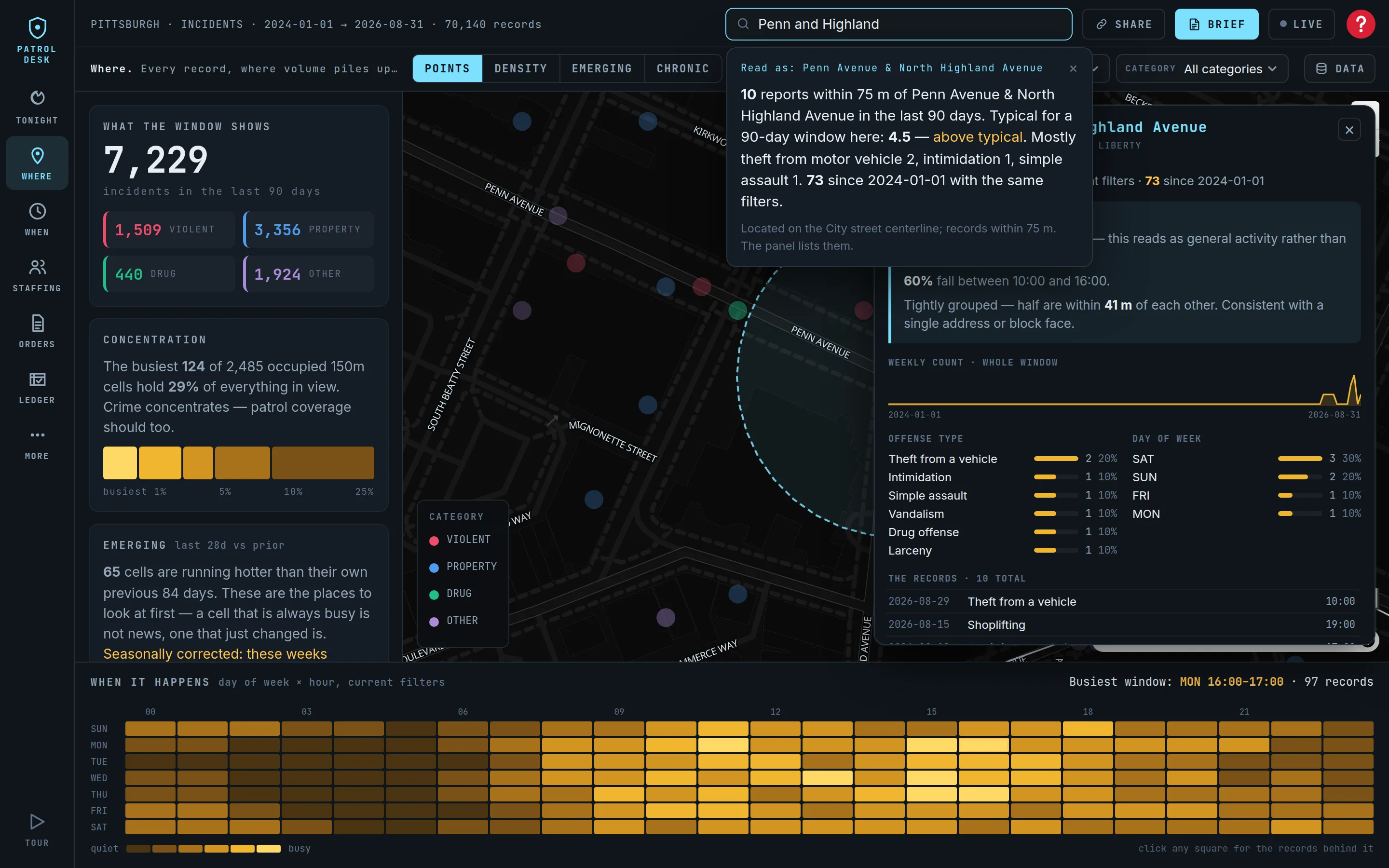
Penn Avenue & North Highland Avenue: 10 reports within 75 m in the last 90 days against 4.5 typical — above typical — with the top types and the count since the data begins. Ask a question instead — burglaries in zone 5 last 28 days — and the answer is a computed sentence with the filters set to match.
A commander who knows the city reaches for a corner in the first minute. This is the beat that decides whether they trust the rest.
EMERGING scores every 150-meter cell against its own previous 84 days, seasonally corrected. The card that answers the question comes first in the column.
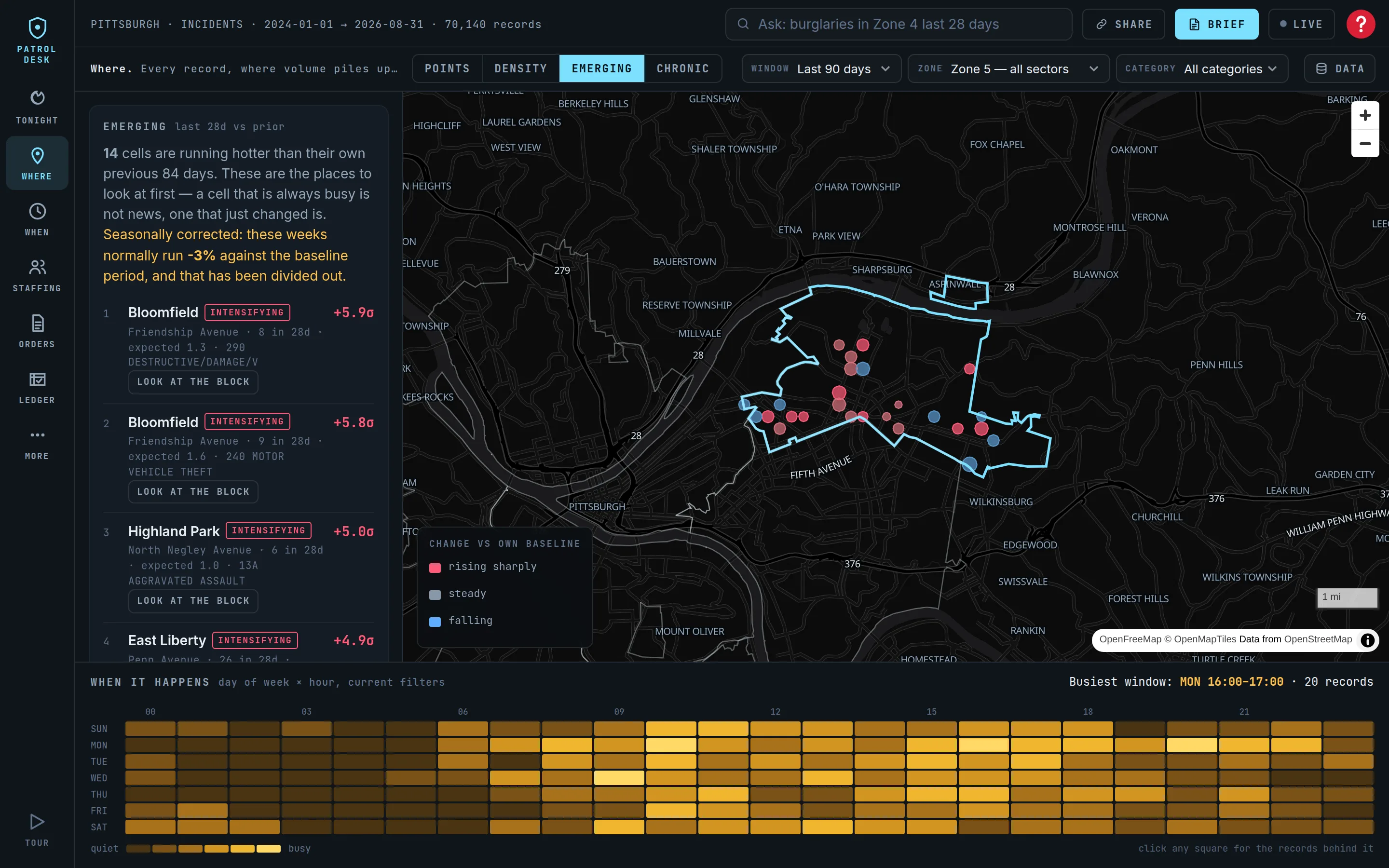
Zone 5: 14 cells running hotter than their own history, ranked by sigma, each with a LOOK AT THE BLOCK button. The map shows rising cells in red, steady in gray, falling in blue.
A permanently busy corner is not news. A quiet one that went from one to seven is. This screen finds change, not volume.
Click any place and the reading is a computed sentence — which offenses, what hours, how tightly grouped — with the records listed underneath.
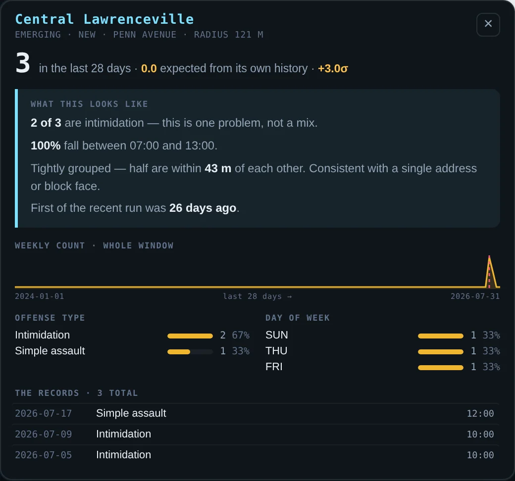
The finding, then the offense mix, the hours, the day of week, and every record with its date and type. Click a record and the map goes to it.
When crime statistics are argued about in public, the argument ends at the records.
Day of week by hour of day, for everything in view, with the whole width of its own screen.
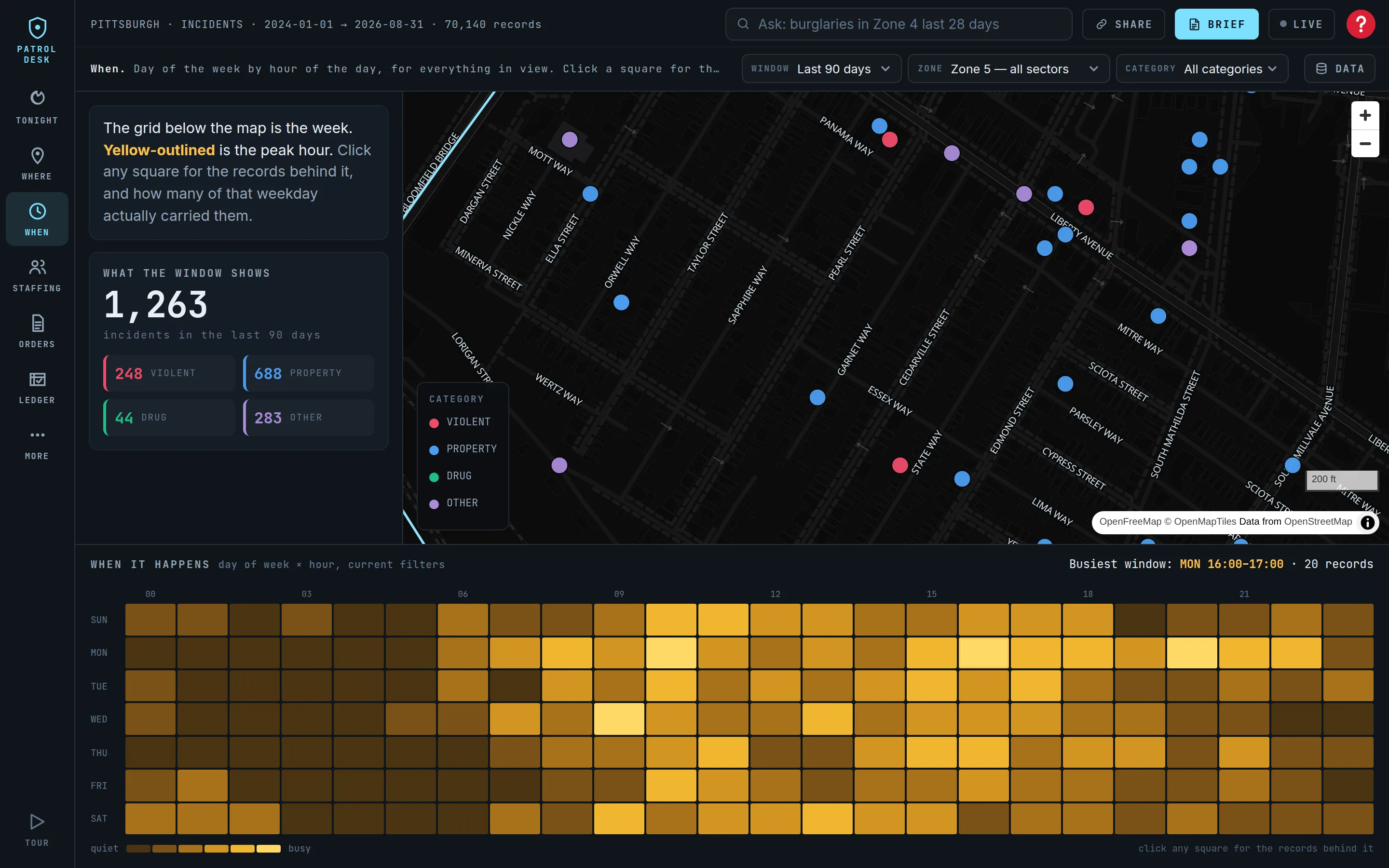
Zone 5's busiest window is Monday 16:00–17:00. Click a square and it says how many of that weekday actually carried records: a standing pattern, or one bad night.
Thirteen of thirteen Mondays is a standing problem worth a standing response. Thirty-four records on one night is already over.
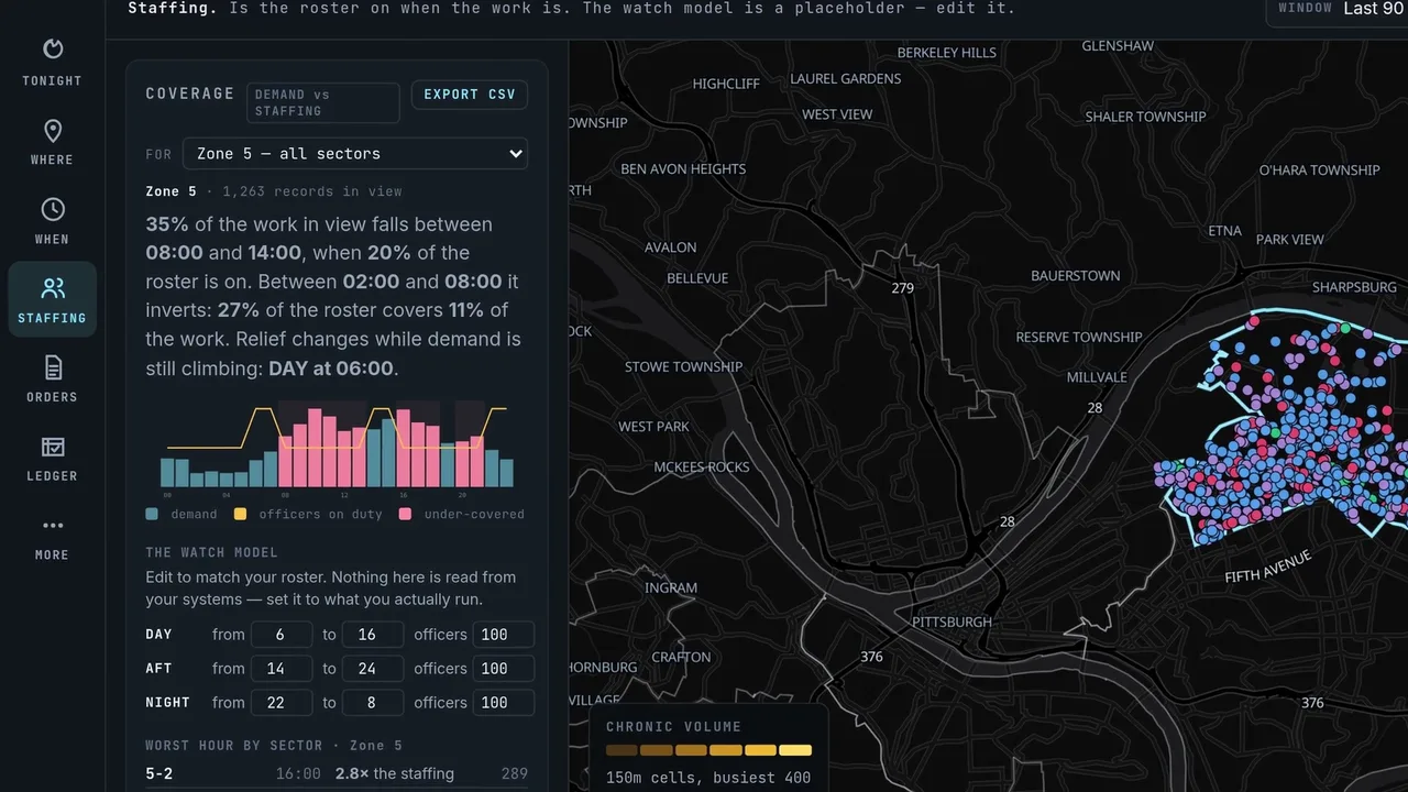
Demand by hour against the roster by hour, as shares, with an editable watch model.
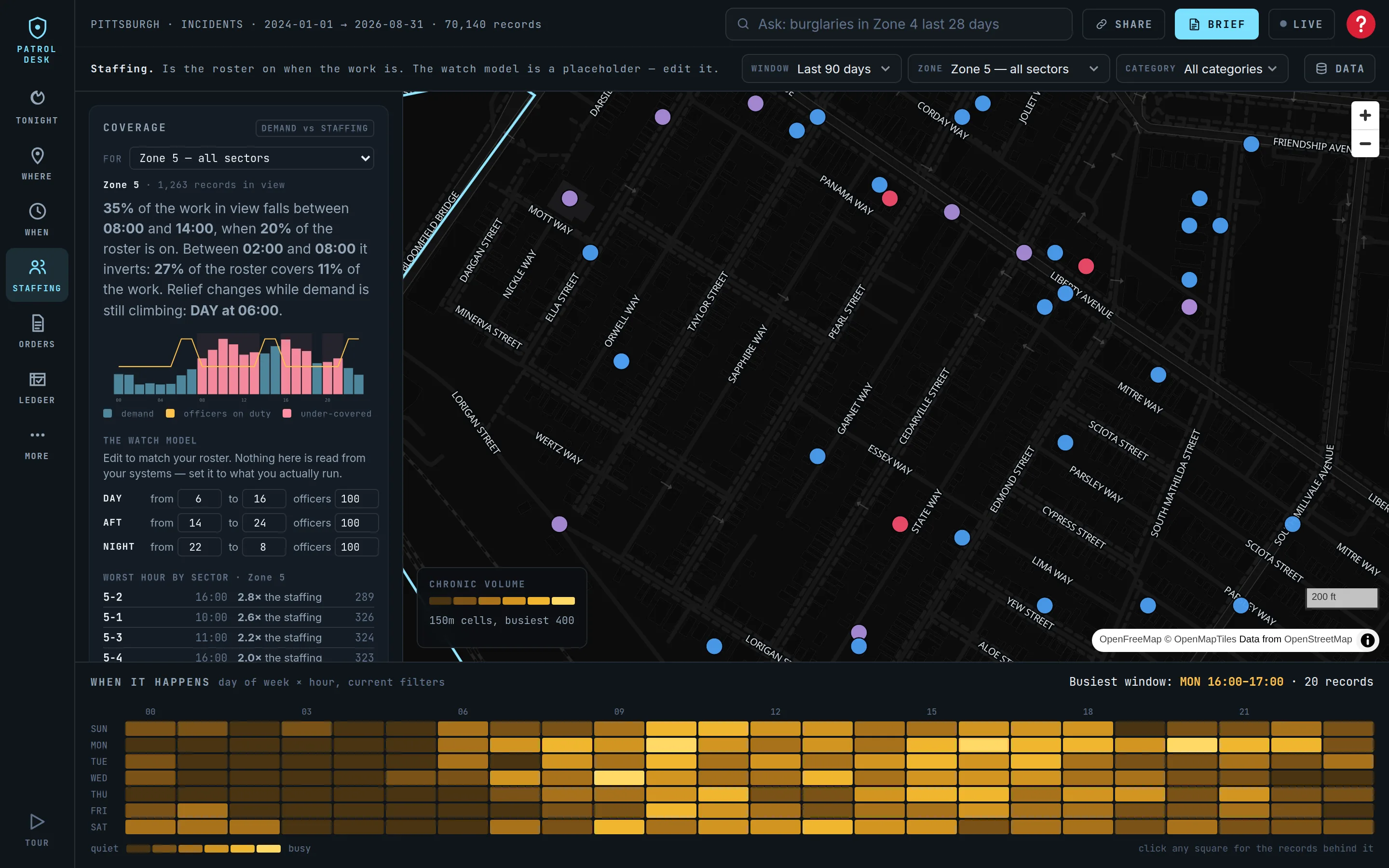
35% of the work falls between 08:00 and 14:00, when 20% of the roster is on. Between 02:00 and 08:00 it inverts. The three-watch model is a placeholder — edit it live and the finding recomputes, per zone and per sector.
For a department that is short, the schedule is the only capacity in the building that costs nothing.
HOLD, CONCENTRATE, SATURATE: places, surge window, the dose, the effect range from published trials, and how long until a reduction that size is measurable.
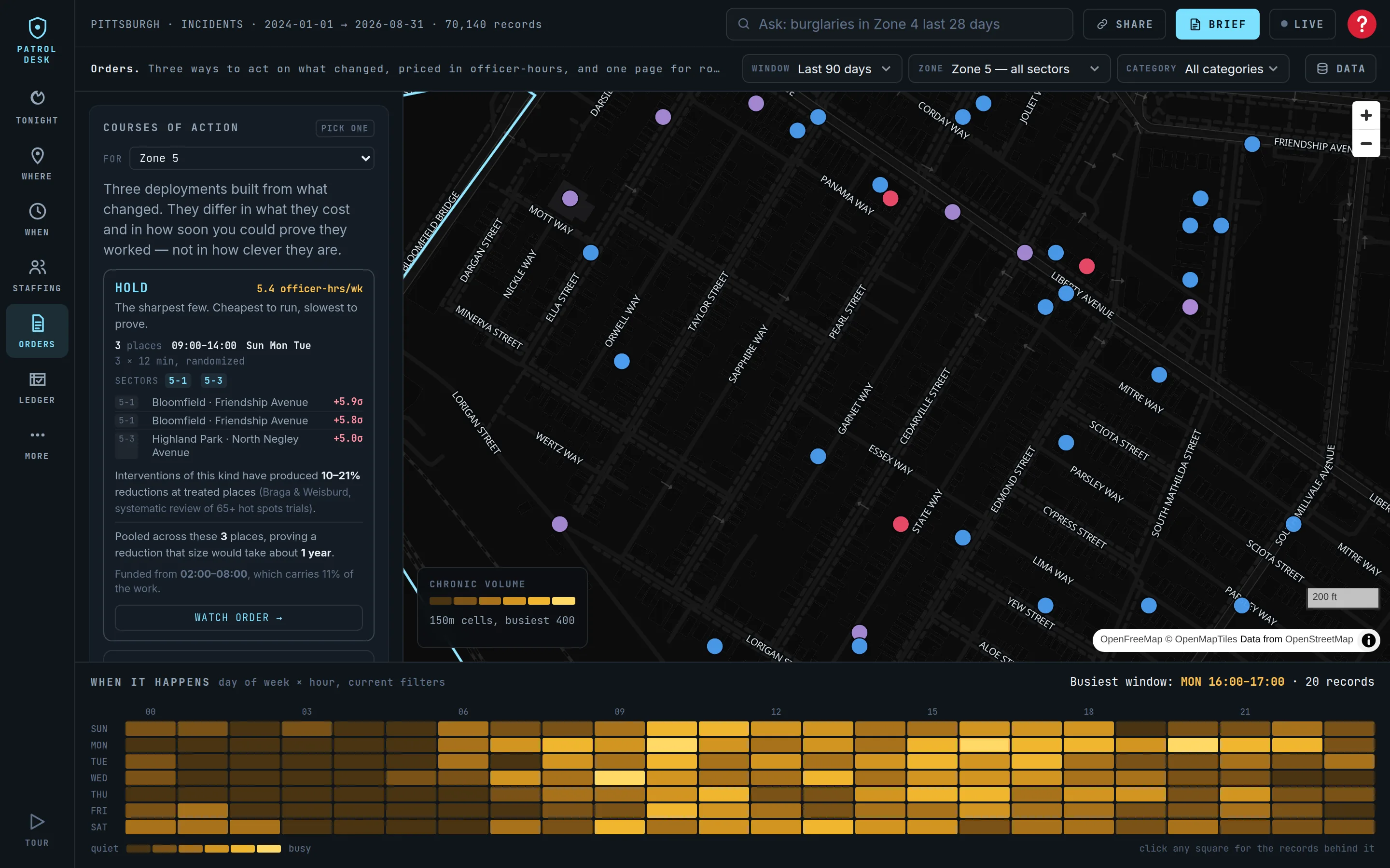
Zone 5, all categories: HOLD 5.4, CONCENTRATE 14.4, SATURATE 28.8 officer-hours a week, 13:00–18:00. One rising place left off because its dominant record is drug equipment — the card says so.
The line nobody else prints is the last one: whether you will be able to tell it worked. Run the ones you cannot prove because the reasoning is sound, not because you will be able to show it.
When, dose, cost, the numbered places with sector and evidence, Before you go, the places seen, what to expect, and one button that records it.
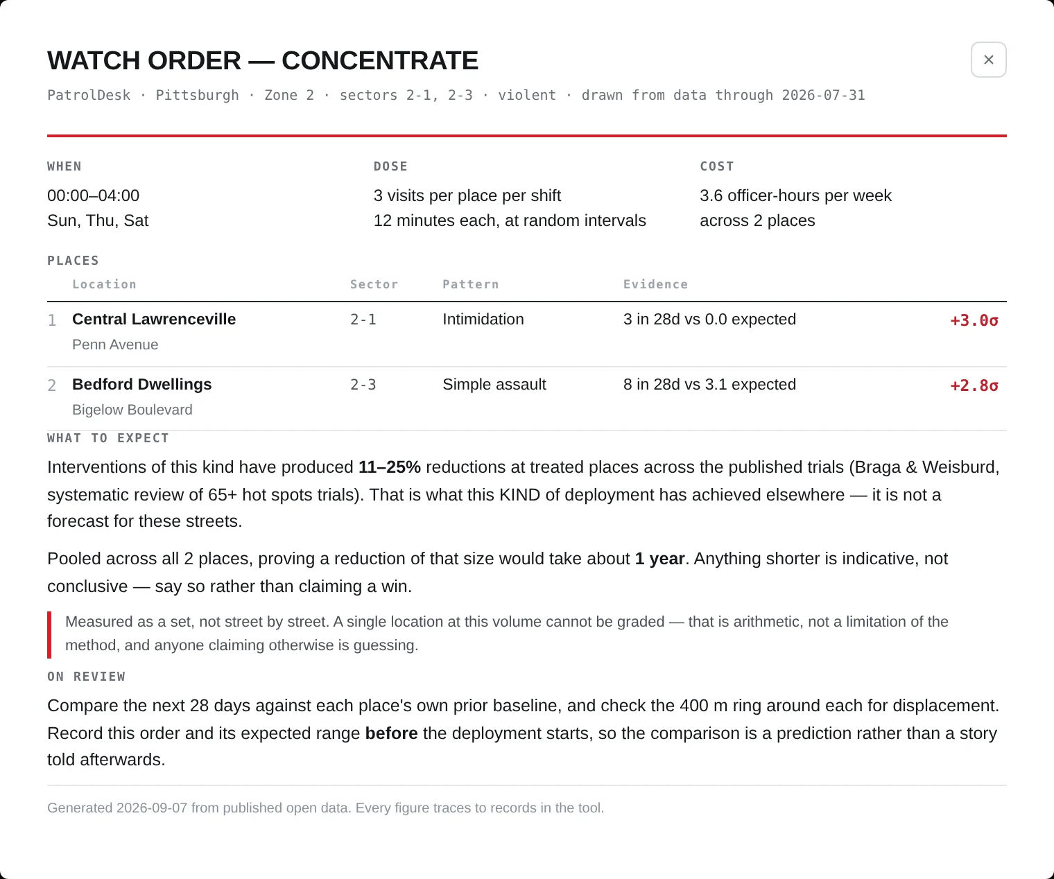
Six places; each with a LOOK AT THE BLOCK button. Before you go: Penn Avenue has 16 weapons, aggravated assault and robbery reports on record since 2024; Frankstown Avenue 13, including a homicide. The camera column reads none known until the department loads its own list.
Recording the order is what makes the review a measurement. Nothing about a recorded order can change afterward.
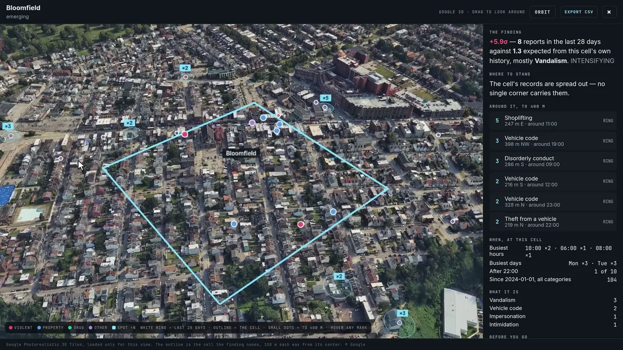
One button on any place opens Google Photorealistic 3D with every record in the window drawn where it happened. Hover any mark and it says what it is.
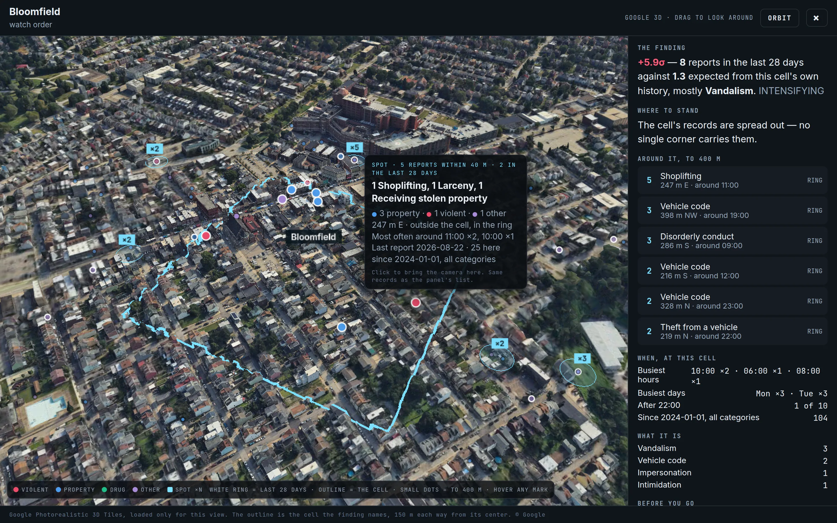
The cell outlined; records colored by category, the last 28 days ringed in white; spots counted ×N. The tooltip on one spot: 5 reports within 40 m, 2 in the last 28 days, most often around 11:00, 25 here since 2024. The panel beside it: the finding, where to stand, the busiest hours, the officer-safety line, the camera line, the most recent records.
A sergeant recognizes a corner faster than an address, and a corner with its records on it faster still. Click a spot and the camera goes there.
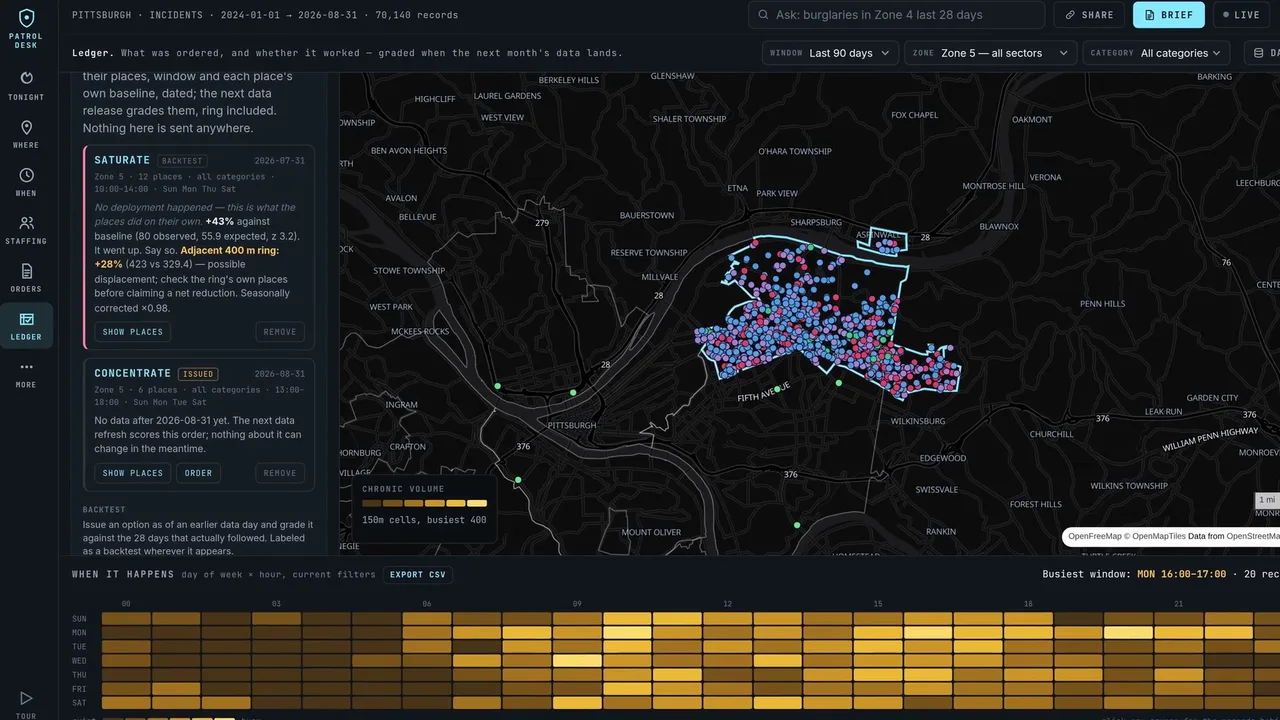
Recorded orders are graded when the next month's data lands, against the places' own history, ring included. Backtests show what places do on their own.
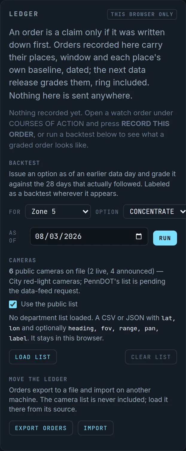
The July 31 SATURATE backtest graded against August: +43%, z 3.2 — “It went up. Say so.” Ring +28%, flagged. No deployment happened; this is the control every real order is compared against.
A tool that admits a null result is a tool whose positive results can be believed. Everything in the ledger stays in the browser and exports to a file.
Two areas side by side, or one area against the same dates a year earlier.
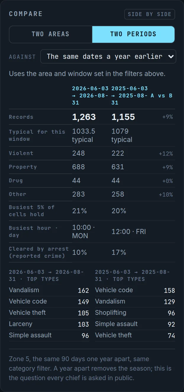
Zone 5 violent, 3 June – 31 August 2026 against the same dates in 2025: 248 vs 222, +12%. Simple assault 96 vs 92, aggravated assault 45 vs 35. Counts, not rates; a year apart removes the season.
The question every chief is asked in public, with the arithmetic under it.
One page per area, per watch, printed from the Tonight screen in one click.
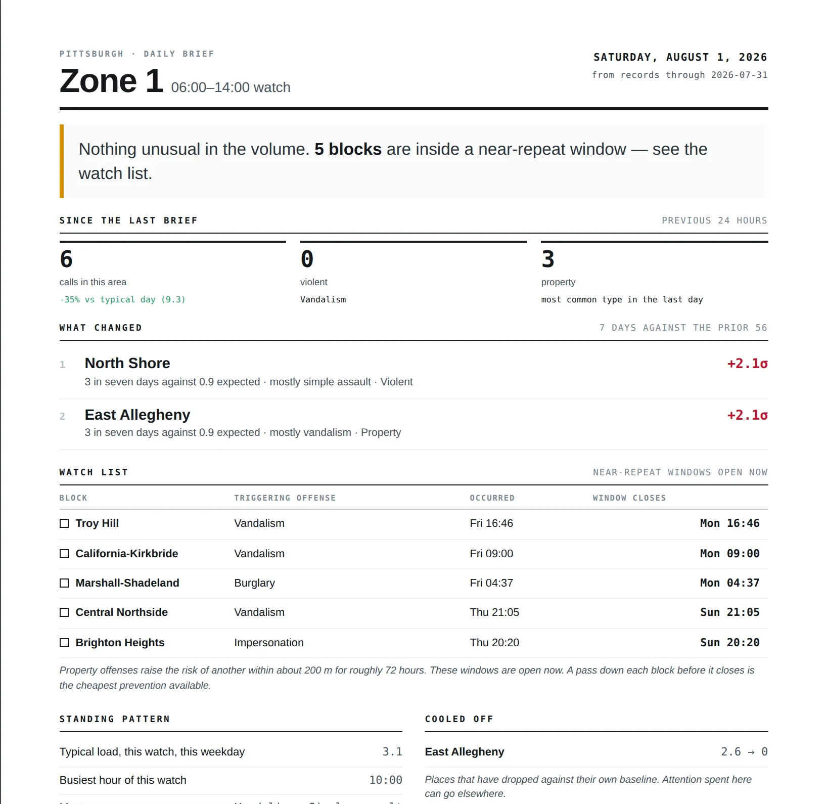
Since the last brief, what changed, the watch list, the hours, and the records behind every line — for one zone and one watch.
A printed page reaches the people a dashboard never will.
TOUR at the bottom of the rail drives the real screens with a spotlight and a caption, in the order a chief would ask for them.
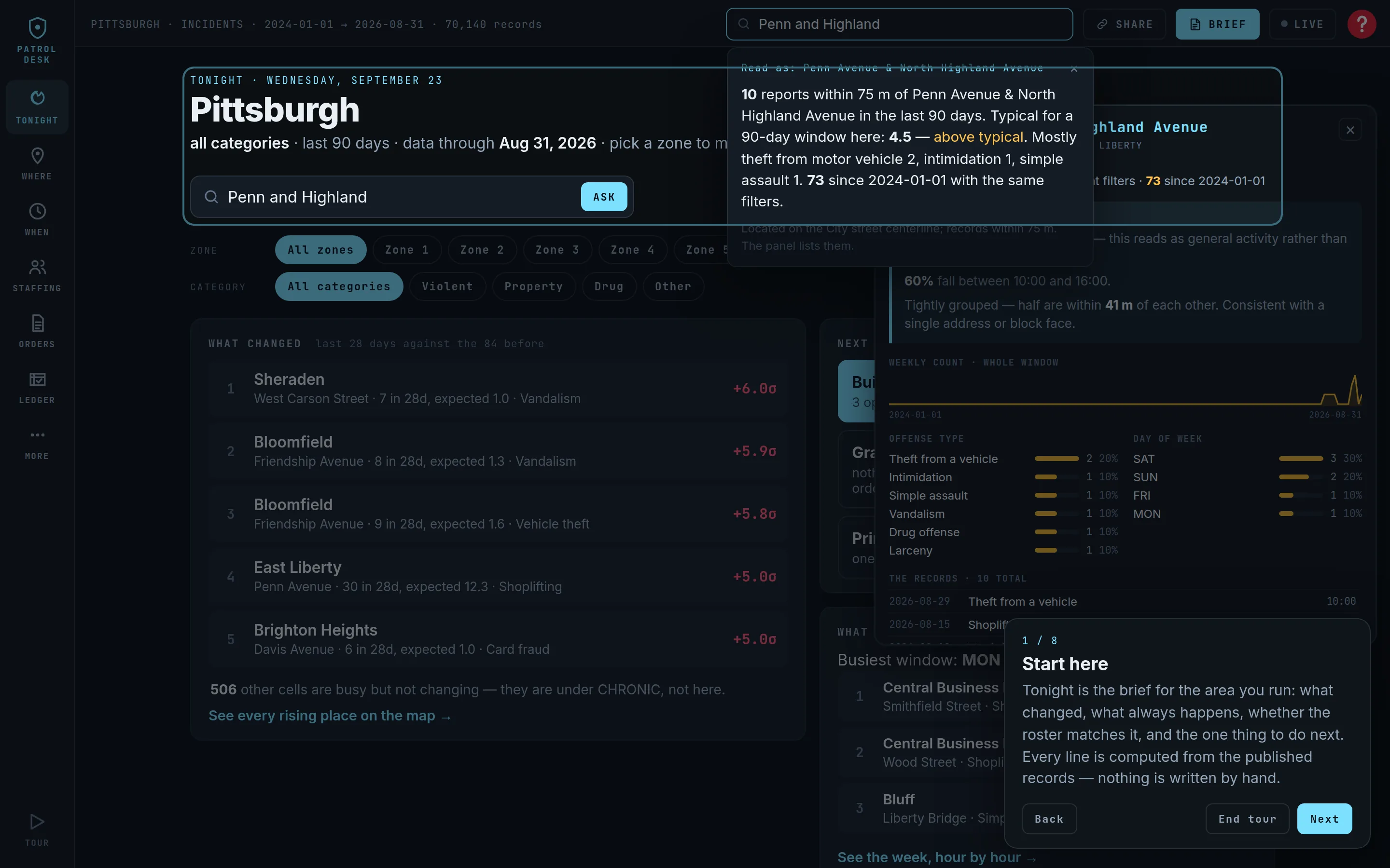
Each step opens the actual screen — not a slide of it — and says in two sentences what it is for.
A demo you can hand to someone. Or take yourself, at 2 a.m., without anyone watching.
The rail folds into a tab bar; the map fills the screen; the findings live in a sheet you drag between three heights.
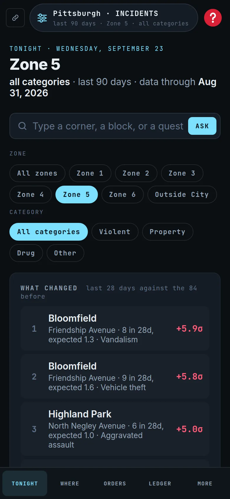
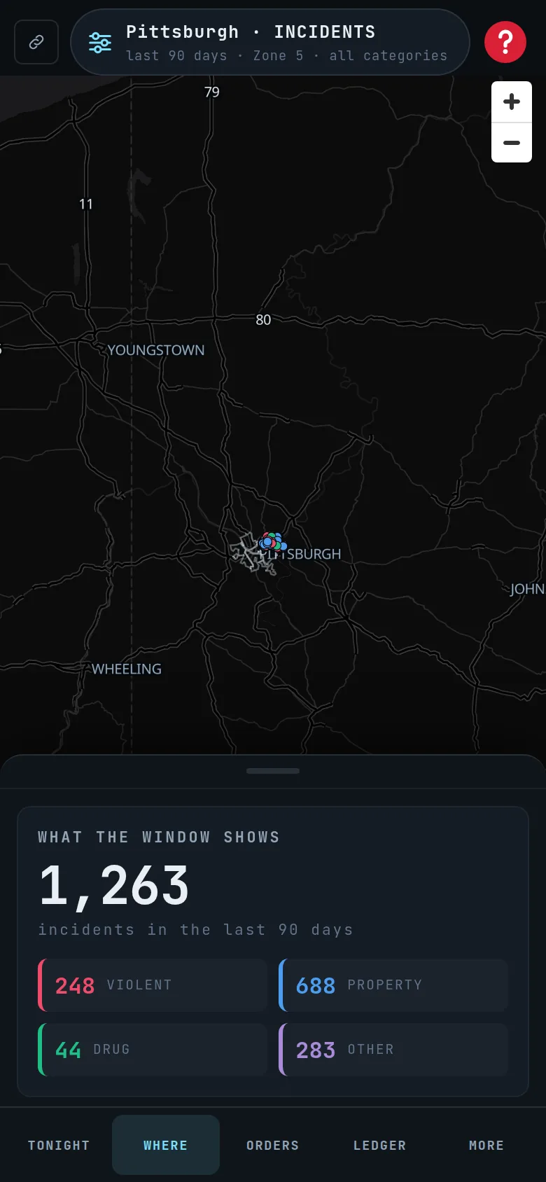
Tonight as a single column with the zone and category chips at the top; WHERE with the map full-screen and the sheet at rest below it.
A commander in a car gets the same analysis as the desk, with nothing hidden behind a layout that assumed a monitor.
If your department publishes incident data, we can show you PatrolDesk running on it before the first call ends.